Drunk Elephant
A short junior UX design project to redesign an existing e-commerce experience.
Project Length
3 weeks
Team
Jasper, Welle, Veronika, Alex,
Michael
Tools
Figma
Role
User research, Style Guide, Wireframes, Prototyping, User-testing
Contribution
Gathered and synthesized secondary data, wireframes, develop style guide, assisted with prototyping and conducted think-aloud user tests
Constraints
Only allowed to use secondary research prior to user-testing. Teammates were added and removed throughout the project timeline.
Client
Drunk Elephant
Our client is Drunk Elephant, a body and skincare brand with a strong and unique brand identity. The brand is committed to using ingredients in their formula that directly affect the skin and are biocompatible with one another. This allows for the products to be mixed together as, what they market, a “smoothie” and applied as one mixture.

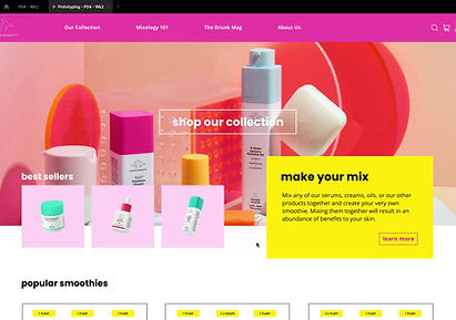
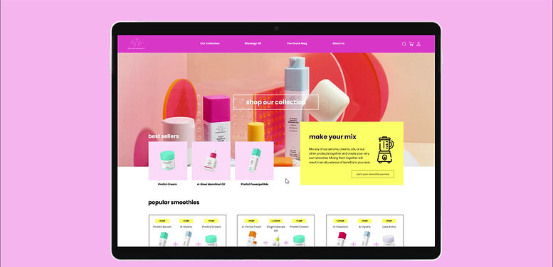
Final Mockup of Drunk Elephant Microsite's Homepage.
Target Audience
The Problem Space
According to Denise Herich from the Benchmark Company, 65% of skincare users already have an understanding of skincare and have their own collection of products. Of that group, 97% of them are willing to try new products but usually only try 1-2 products at a time to test if the product works for their skin or their collection.
This contradicts Drunk Elephant’s smoothie concept where it promotes a bundle of their products which may be beneficial to new users but not experienced skincare users.
How might we clarify the brand's integral smoothie concept and encourage the user to engage with it?
Guiding Principles
Guiding Principles for E-commerce website
Alongside gathering secondary research about skincare users, we analyzed EngineDigital's design brief for Kit + Ace to develop our guiding principles for our future e-commerce website.
Adapt to Different User Goals
No store has only one designated user. Instead, designers should form the user experience in a way that allows the users to easily achieve different goals.
Frame the Product in
Context of the User
Entice customers by framing the presentation of the product as something they will use in their life. The brand’s products should feel personal to the user and their needs.
Connect the Brand and the User
The site is more than just a store, it is a window into the brand’s identity. Content should be delivered to encourage understanding and promote connection between the user and brand.
Synthesizing Data
Discovering Pain Points
As a team, we individually analyzed the existing Drunk Elephant website for pain points. We paired this knowledge with our secondary research and insights to understand the user-flow of existing and new users.
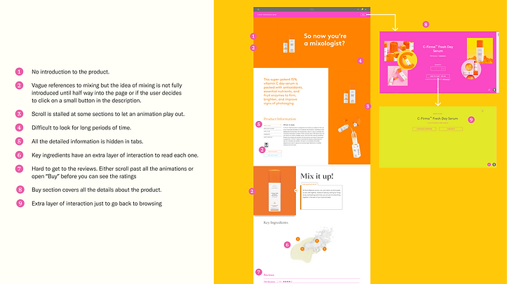
Image highlighting the pain points of the original Drunk Elephant website.
Narrowing Focus
Customer Journey
We studied the 5 main points of the customer journey and decided to focus our improvements to be considerate of the “Enter,” “Engage,” and “Extend” portion. We concluded that the “Enter,” “Engage” were the areas integral to teaching users the smoothie concept and design problem. While the “Extend” encourages customers who are only willing to purchase a single product to engage with the smoothie concept through free samples and return for more.

Image of the 5 main points of the customer journey map.
Wireframes
Medium-Fidelity Wireframes
We used the Crazy 8s method from the Google Design Sprint Kit to generate sketches that would implement our
guiding principles. We primarily used my sketches, thus many of my ideas were implemented it into our final wireframes such as the home-page, mixology 101 page, and product page layouts. For the final wireframes, we split each page amongst the five of us, where I focused on the product page.

Screenshot of the final wireframes for the first iteration of the website.
Mockup and Prototype
High-Fidelity Prototype
I incorporated our improved style-guide into our wireframes and conducted quality control for the static mockups to ensure pages were consistent. Then a teammate and I used Figma to prototype the user flow of a returning and new customer.
New User-flow
Returning User-flow

Product Page Micro-interaction

User-testing
Think-aloud User-testing
To gain insight about our prototype, I conducted 5 virtual think-aloud study and A/B testing of 3 different product pages. The participants had sufficient experience with e-commerce websites but low to no interaction with Drunk Elephant. We did an A/B test for the product page, because we were concerned our original smoothie indicator may be confusing.
During the user-test, I asked about the participant's first impression of the site and followed it with 2 scenario questions to observe their interactions to compare with our user flow. It was followed with a post-test interview to further understand their thought process.
Original Iteration

Label Variant
Tooltip Variant
Legend + Marker Variant

Synthesizing Data
Insights from User-test
Since we were receiving similar responses from our participants, I stopped user-testing and synthesized our data into 4 main insights to consider for the 2nd iteration.
Users Define their own Journey
Many user flows that did not align with our initial expectations. We need to accommodate for these alternative user flows.
The Brand’s Smoothie Concept Only Exists Online.
Users who received the product in store have no understanding of the brand’s mixing idea. Despite 3 users having experience with the brand, none of them were aware of the smoothie concept.
Limit the User's Reliance
on Reading.
Most users simply skim content. They are not coming to the site to read long articles and we should find a different way of presenting the smoothie concept.
Discovery Before the Sale.
Users want to know more about the products before they consider adding it to their cart. We need to give them enough information before offering them the add to
cart button.
Revisions
User-test Improvements
I shared my insights and advised the team on how to make improvements that reflect our user-test findings. This included me providing a few rough sketches of recommendations and group meetings where I would give feedback to revised mockups.
Aim for Engaging and Informative Content
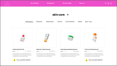
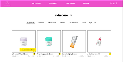
Participants did not engage with the smoothie call to action, we revised it to be more enticing by adjusting the copy and help users recognize rather than recall the smoothie icon when they are go to other pages.
We also added more content as user feel satisfied or informed of the brand's products.
Moving forward with tooltip variant
Our participants preferred both the tooltip and the label variant of the smoothie icon. We moved forward with the tooltip because it was minimal and effective.

Landing Page Before
Landing Page After

Tooltip Variant Prototype
Final Iteration
High-Fidelity Prototype
Below is a full walk-through of our final prototype.
Final Drunk Elephant Prototype walkthrough video.
Next Steps
Reflection
Through this project, I was able to learn the basis of how to conduct user studies and as designer our intention take trial and error to fully land. I understood when it is acceptable to take user feedback and when it is better to go with your intention, such as the product page micro-interaction. Furthermore, the value of using multiple techniques and methodologies to specify and target the root issue of the project. My team shifted to focus on 3 of the 5 stages of the customer journey helped us have a clear goal from the start to end.
Furthermore, our team acknowledges we need to do more research to perfect this project. Our team framed our project around the notion that the smoothie concept is important to the brand based on how the original site was laid out and the online reviews. However, our user insights tells us that the smoothie concept only exists as part of their online ethos and we have a lot more users being introduced to the concept than we first thought. If possible, I would like to conduct primary research on a large scale to examine how many customers are actually invested into the brand’s smoothie idea and how many would be willing to try it.